I see the same question on social media over and over again: “What is the best gray paint for my walls?”
I hate to be the bearer of seemingly bad news, but here’s the answer: there isn’t one “best” gray. Despite what marketing gurus may try to convince you of, there is no one-size-fits-all gray paint color OR paint color “palette” that works for all homes. In fact, gray might not work in your home at all.
Why? Color is relative. A color that looks great in one home might look absolutely heinous in another home. Color depends on what’s around it.
Let’s Chat about Gray
Gray can have three different undertones: green, blue, and purple. This means gray is inherently a “cool” color.
An “undertone” is just that: the color that’s kind of hiding behind the color you see. These undertones have to play nicely with the other undertones in a room. Where are the other undertones hiding? In the other elements of the room: the flooring, the woodwork, the fireplace, the counters, the tile, the furniture – whatever else is in the room.
The thing about undertones is that they don’t all play well together.
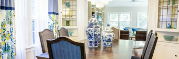
In this room, the walls are green gray, the fireplace is blue gray, and the rug is purple gray. The green gray walls look dingy and dull against the blue gray stone. It’s not the best color for this room.

The best gray would have been a blue gray that would compliment the stone. In fact, blue looks so nice with the stone that we ended up selecting an actual blue for the walls.

There’s another lesson in this choice: There are many more color options out there other than just gray and beige.
Let me repeat that. You can select an actual color for your walls without making your home look like a clown factory. This specific blue we choose is actually on the Sherwin-Williams “whites” palette. It’s very light and airy and not at all intrusive.
Ok, enough of my color ranting – let’s get back to taking about gray.
What if you have beige undertones?
Selecting a gray for your walls gets even more complicated when beige undertones are thrown into the mix. In general, beige and gray don’t play well together.
Beige has five undertones: green, pink/red, yellow, orange, and gold. Beige is inherently a “warm” color.
If your house has stained woodwork, it’s likely either yellow or orange beige. (Unless you’re lucky enough to live in a century home, in which case the woodwork is likely red or even just a dark brown.)
This home has orange oak trim.

Orange and yellow are very warm undertones and don’t mesh well with the super cool undertones of most grays. The biggest issue is that the cool undertones in gray end up making the warm undertones in woodwork even more obvious. If you paint the walls super cool gray, you’re going to make your orange oak woodwork look even more orange (which is the opposite of what most folks want these days).
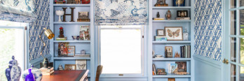
Do the walls in the photo above look gray to you? Yes.
Here’s the truth: They’re not gray. They’re actually taupe, which is in between gray and beige. When taupe is in a room with a lot of warm undertones, it appears gray enough.
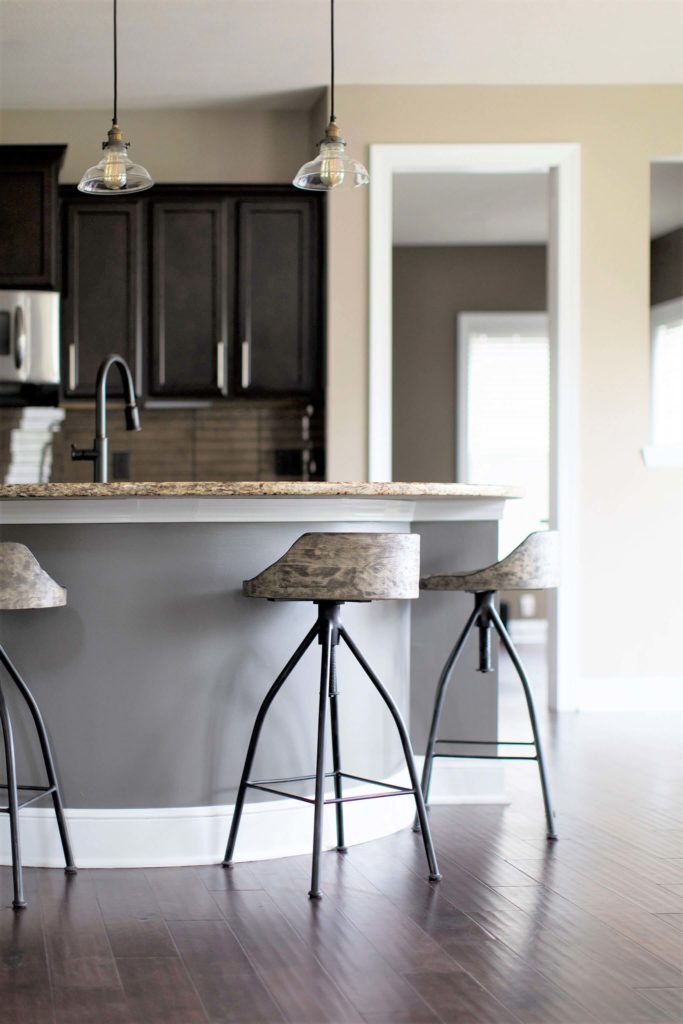
Another fixed element that can influence the gray that’ll work in your house is your floor color. Most wood floors are probably yellow, orange, or pink (red) beige. Again, those are all warm colors.
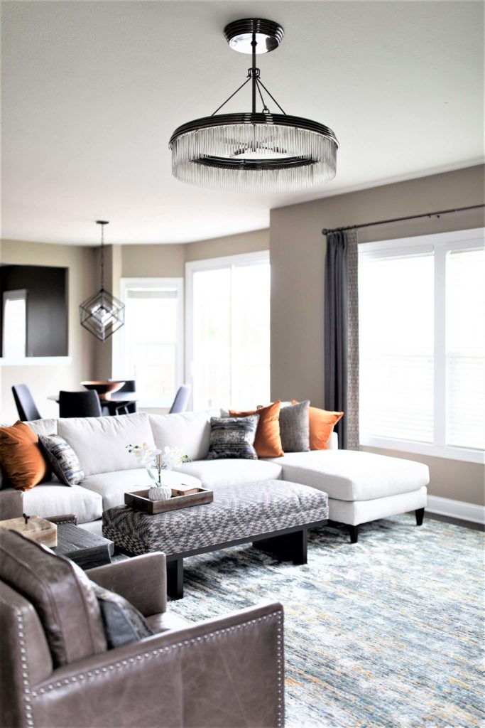
This home has yellow beige floors, cherry cabinetry, and a pink beige backsplash. My client wanted a slightly cooler palette, but we knew gray would be way too stark in her home.

And so we went with a taupe! These are “in progress” photos, but you can already see the difference changing the paint has made.

If you’re just looking to lighten up your home after the dark Tuscan trend of the early 2000’s, don’t overlook beige. The word “beige” tends to scare people because the beiges of old were rather dark and frankly quite ugly.
Here’s a great example of what people think of when they hear “beige.” It’s dark and not at all what’s trending at the moment.

Here’s the same room with a pink beige on the walls.

Yes, you read that right. This is pink beige. It plays so nicely with the very red undertones in the cherry floor. It’s super light without being stark white. It looks nothing like the super gold walls that were popular 15 years ago. It’s perfect for this room.
There are MANY light, airy beiges out there that work so well with warm wood undertones and don’t leave your house looking like a dungeon.

This home also has yellow and orange oak – like many Colonials in Ohio. Instead of fighting with the natural warmth of the floors, we selected a yellow beige. Again, it’s very light and bright, and the neutrals in the rug also flow so well with the walls.
See what I mean?

But I MUST HAVE GRAY!
If you really need gray in your home filled with beige undertones, charcoal gray is a wonderful alternative.
Here, charcoal plays very nicely with the yellow beige granite counters, green beige walls, and cherry floors.
Here’s another example of charcoal fitting in very nicely with the red floors and orange cabinetry. (Yes, those walls are also taupe.)

So to sum things up, there is no perfect gray. In fact, gray might not be right for your home at all. You can still achieve that light, bright feel with a taupe or beige – it just has to be the right one for your space.

(Yep. This is taupe, too.)