Here are the top ten decorating mistakes I see all the time. These mistakes are all pretty easy to fix, so don’t fret!
1. Hanging artwork too high
If art is just floating on the wall with nothing beneath it, art should be hung so the middle of the piece is 60″ from the floor. I can always tell if someone super tall hangs the art – it ends up a foot away from the ceiling!
If you hang art above a table, bed, or sofa, the art should be between 4″ to 8″ above the top of the furniture. I know this is exactly NOT what non-design-y people want to hear, but the exact perfect height is often just eyeballed. Anything between 4-8″ will work for you, though.
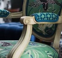
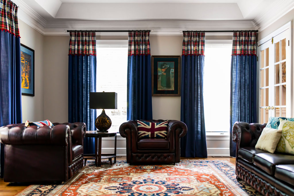
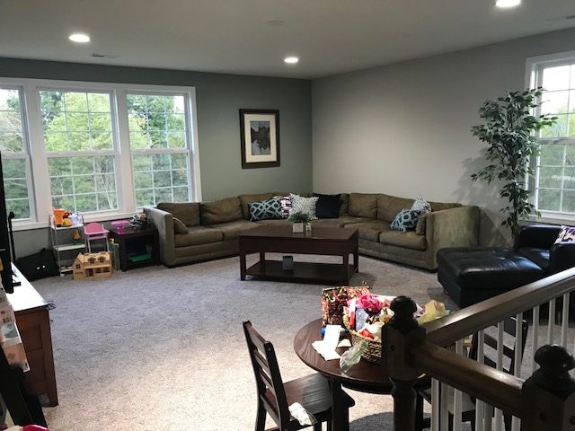
2. Matchy-matchy furniture
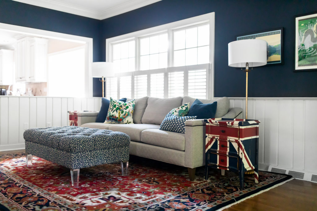
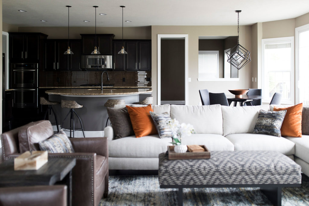
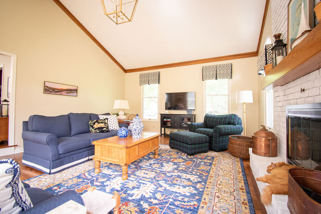
Your furniture should not all match. This means your sofa, loveseat, chairs, and ottoman should NOT all be the same fabric. In fact, I strongly recommend that your pieces not even be from the same product line. Timeless homes have a collected feel. There’s nothing less anti-collected that “I bought all of this matching furniture from one place on the same date.”
Side note: It’s completely fine if you have a matching sofa and loveseat. That’s no different than having one large sectional. What kills the design is if you ALSO have matching chairs and/or an ottoman. Mix it up!
3. Decorating around a paint color
As I’ve said here, select your paint last. Let me repeat: Paint. Your. House. After. You. Pick. Everything. Else.
Why? Because it’s easy to select a color right from your fabric palette. It’s very difficult and time consuming to have to try to weed through thousands of fabrics to find the one option that might go with the specific shade of seafoam green you fell in love with and painted all through your home.
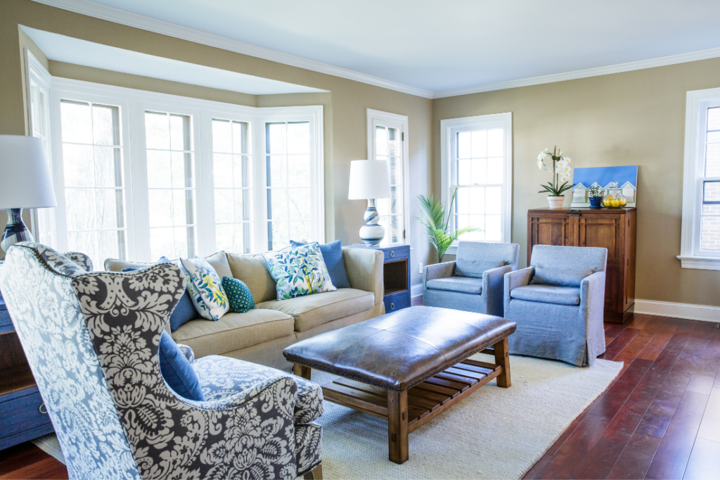
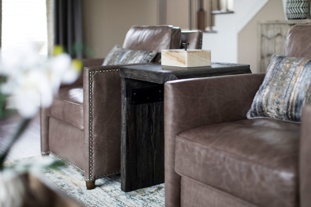
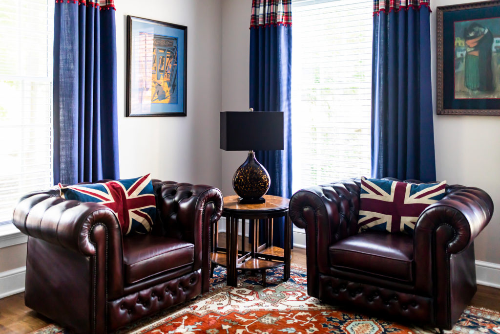
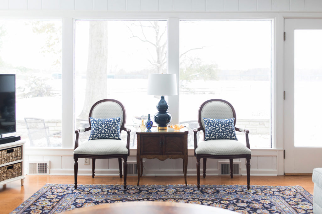
4. Side tables that aren’t the right scale
Ideally, side tables should be no more than 2″ shorter or taller than the arms of your chair (or sofa, etc.).
The side table’s visual weight should also correspond with the furniture itself. What the heck does that mean? That means if the table is beside chairs that look “light,” such as the bottom right Louis chairs below, then the table should also be “lighter.” In the example below, the table has legs, instead of a solid base, making it lighter. If the chair or sofa is heavier, such as with the leather chairs in the top left image below, the table itself can have a heavier feel. The table in the top left is made of solid reclaimed wood with thicker legs. This weight balances the heavier feel of the chairs.
5. Bright white trim in a house full of warm neutrals
It is tempting to paint everything the absolute brightest white possible. Sure, it looks very clean and bright. However, bright white doesn’t play very nicely with a lot of more muted tones, such as in the taupe rooms below. Instead of using something like Sherwin-Williams SW 7006 Extra White, try an off-white that looks good with both bright and muted tones, such as Sherwin-Williams SW 7005 Pure White, Sherwin-Williams SW 7008 Alabaster, or Benjamin Moore’s OC-17 White Dove.
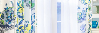
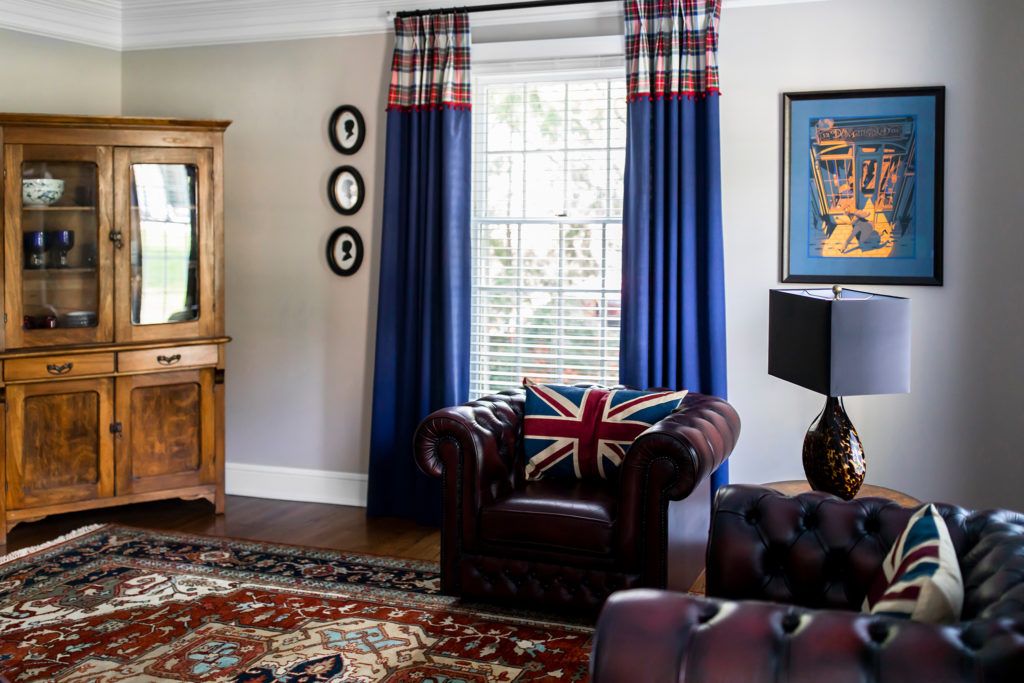
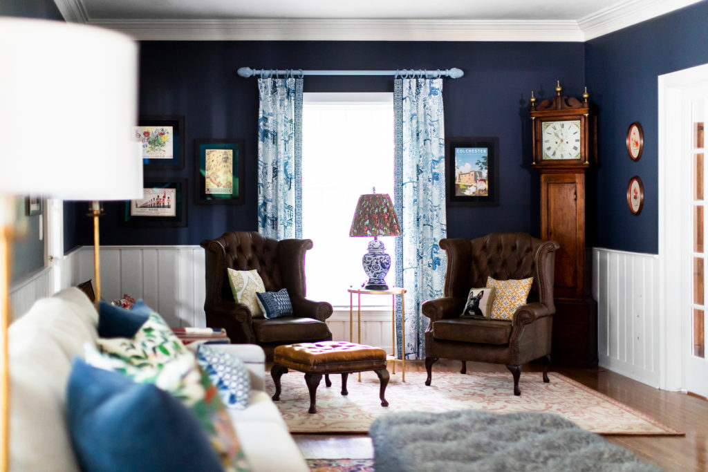
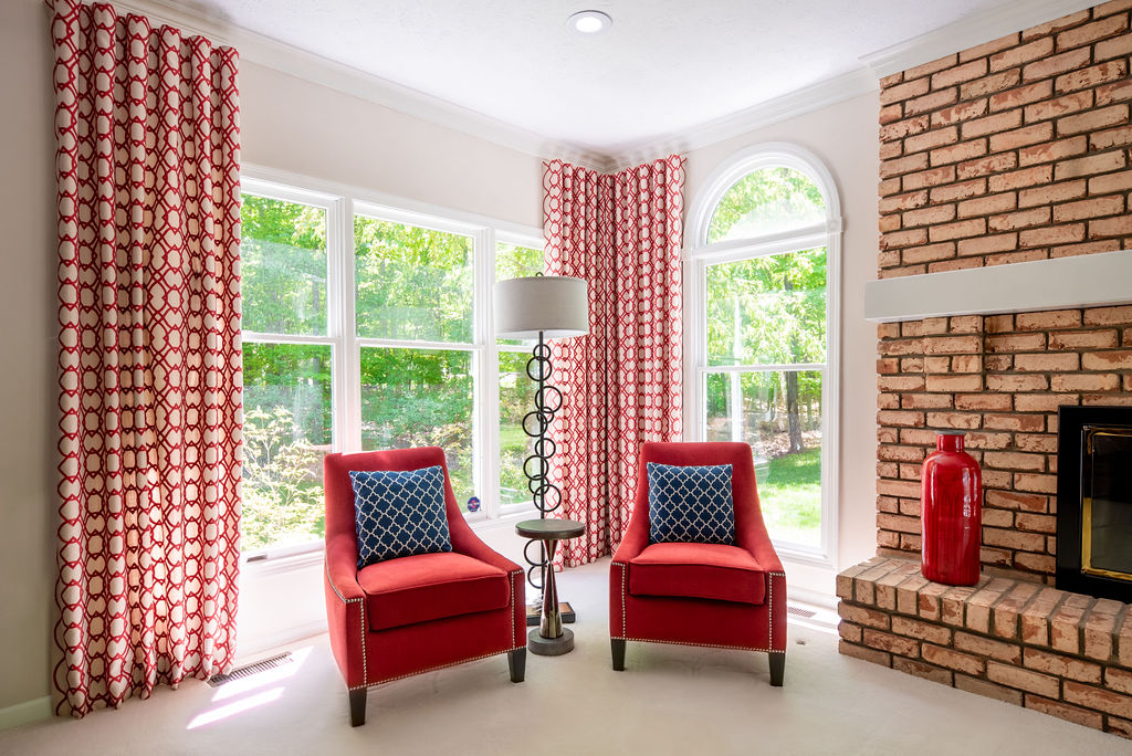
6. Hanging drapes too low and close together
Oh man. I have seen so many bad drapes. Most people with 8-foot ceilings hang 84″ drapery panels, which puts the rod right at the top of the window’s trim. If your goal is to make your windows feel as short as possible, then congratulations – that’ll do it.
People also tend to hang their rods just to the widow’s left and right edges. When they go to open the panels, the panels cover half of the window. If your goal is to have as little natural light in the room a possible, the congratulations – you’re a drapery master!
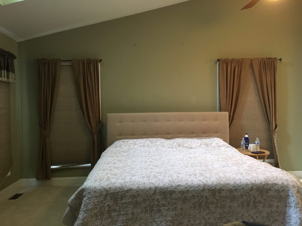
If you’d rather your windows not feel squatty and block most of your natural light, then hang your draperies above the top of the window frame and wider than the window. When the drapes are open, they should not block any of the window’s glass.
How high above the window frame should you hang your drapes? That’s more of a personal preference, as well as a “What looks best with the style of your home?” question. For more traditional homes, I tend to hang the drapes halfway between the window and the ceiling molding. For a more contemporary feel, I go with drapes hung right to the ceiling (or the ceiling molding).
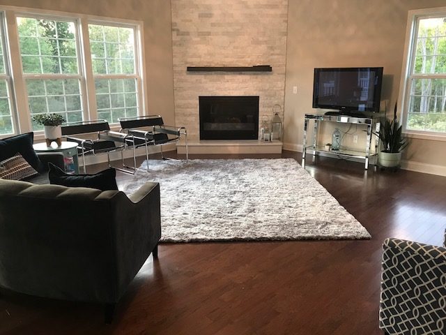
7. Putting a small rug in a big room
All of your main furniture needs to have at least its front legs on top of your rug. A postage-stamp sized rug is going to chop up the visual lines of the room. In an average sized living room, the smallest your rug should possibly be is 8′ x 10′. In a larger room, you’ll need at least a 9′ x 12′, if not a 10′ x 14′. In really large rooms, you may need two different rugs, or one large custom-sized rug.

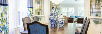
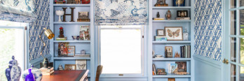
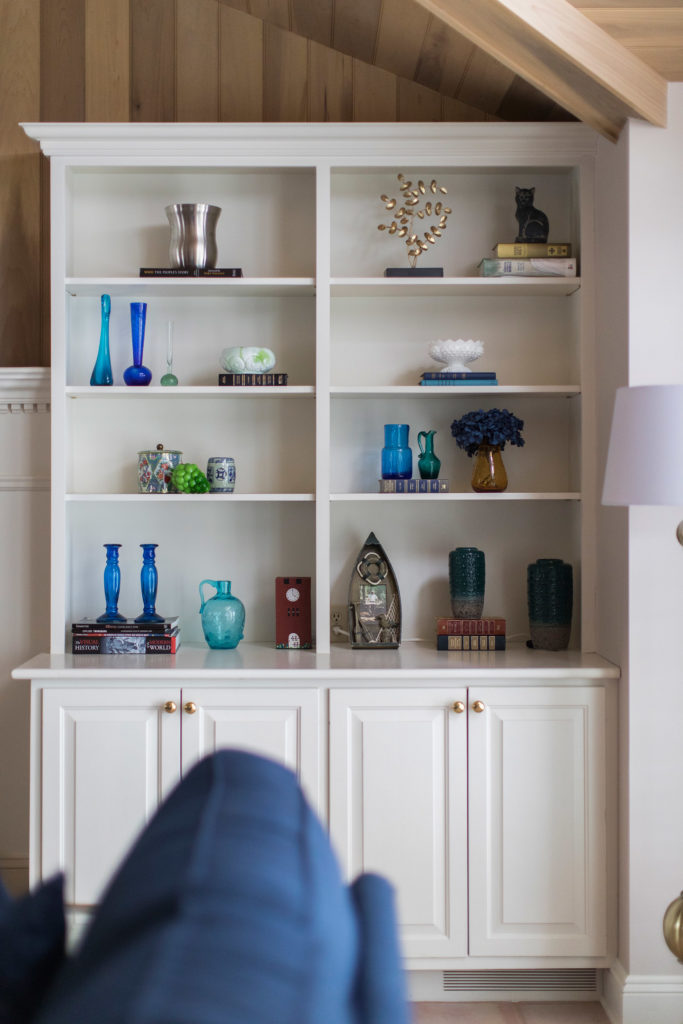
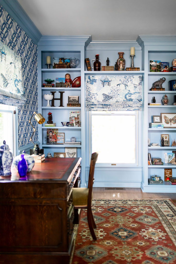
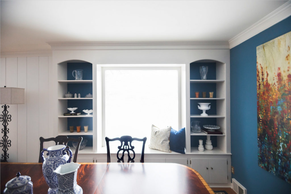
8. Too many tiny accessories everywhere
When it comes to accessories, less is more. Every surface doesn’t need to be covered with knickknacks and tchotchkes. As a general rule, opt for fewer large accessories, rather than more tiny accessories.
Bookshelves should also have breathing room. Bookshelves are the perfect place to display collections (and books, of course). However, make sure there is space between your items. Let the eye rest every once in a while.
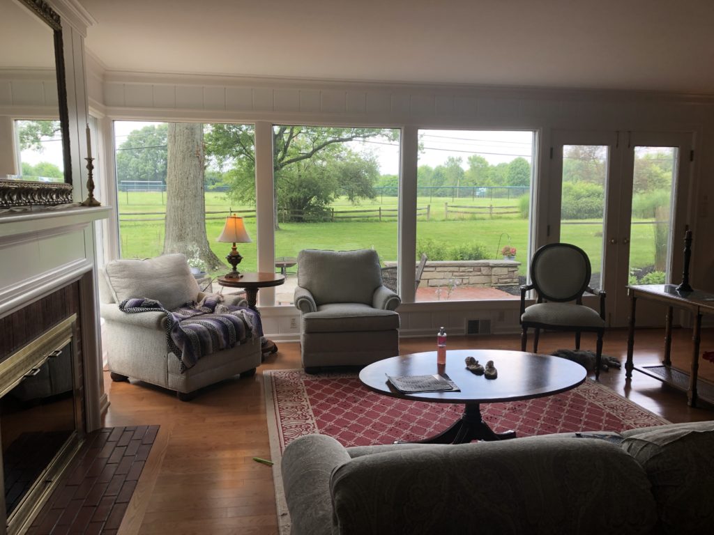
9. Lining furniture against the walls
Your furniture does not have to live like Wyatt Earp, with its back constantly against a wall in fear of a surprise attack. Float your furniture away from the walls to create a more inviting and practical conversation area!
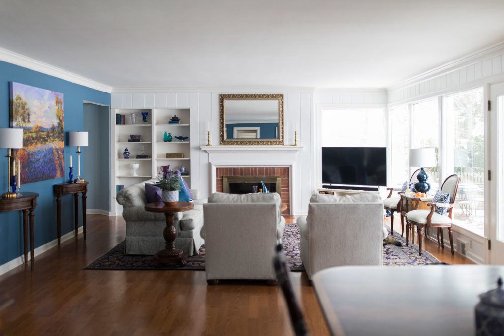
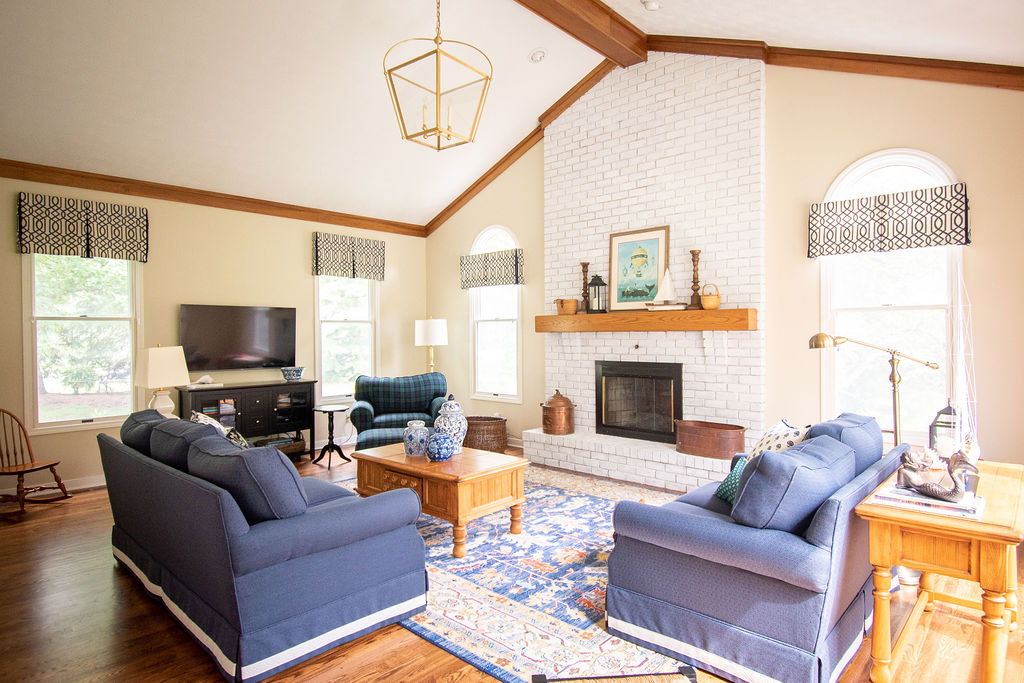
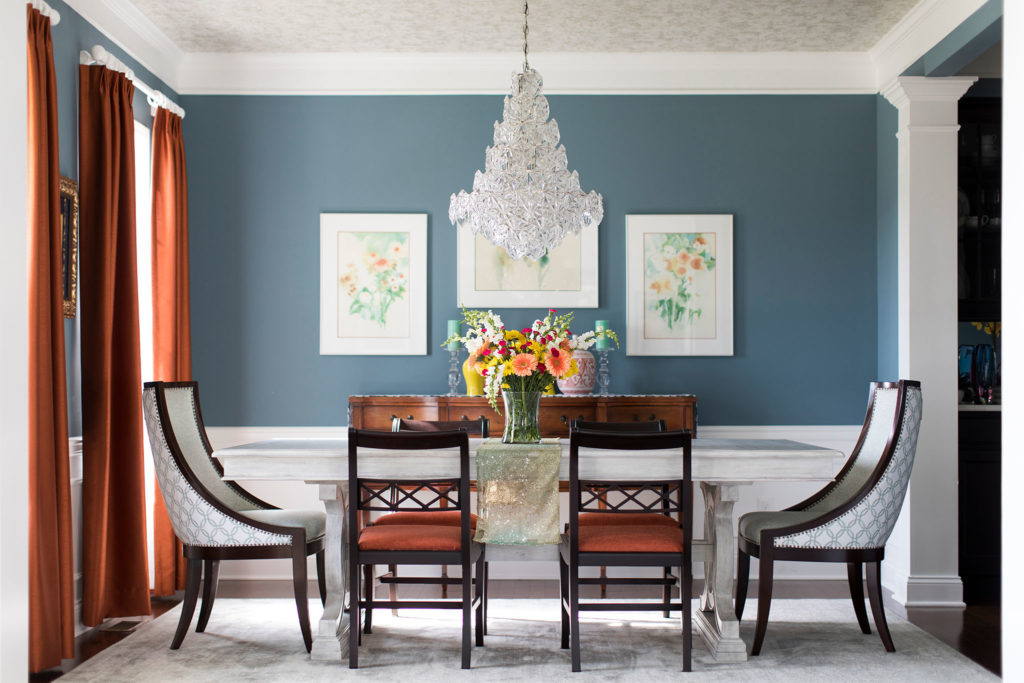
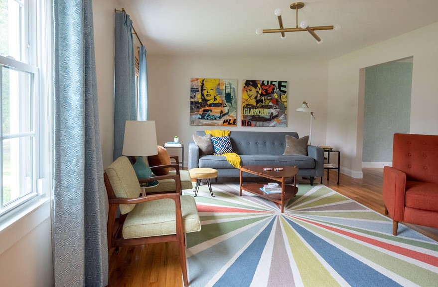
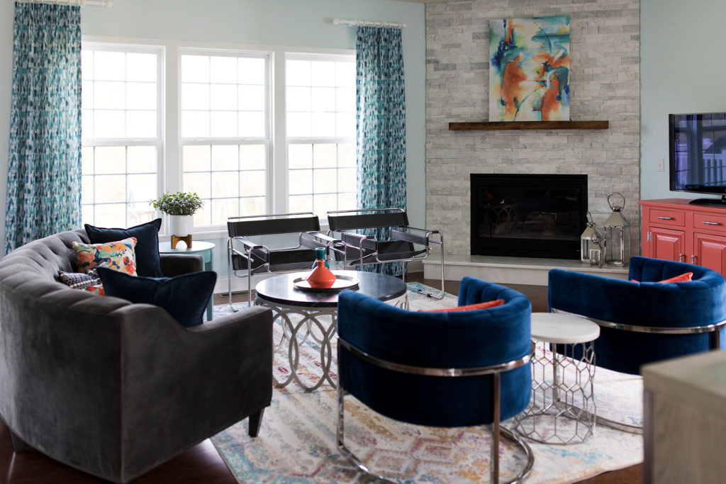
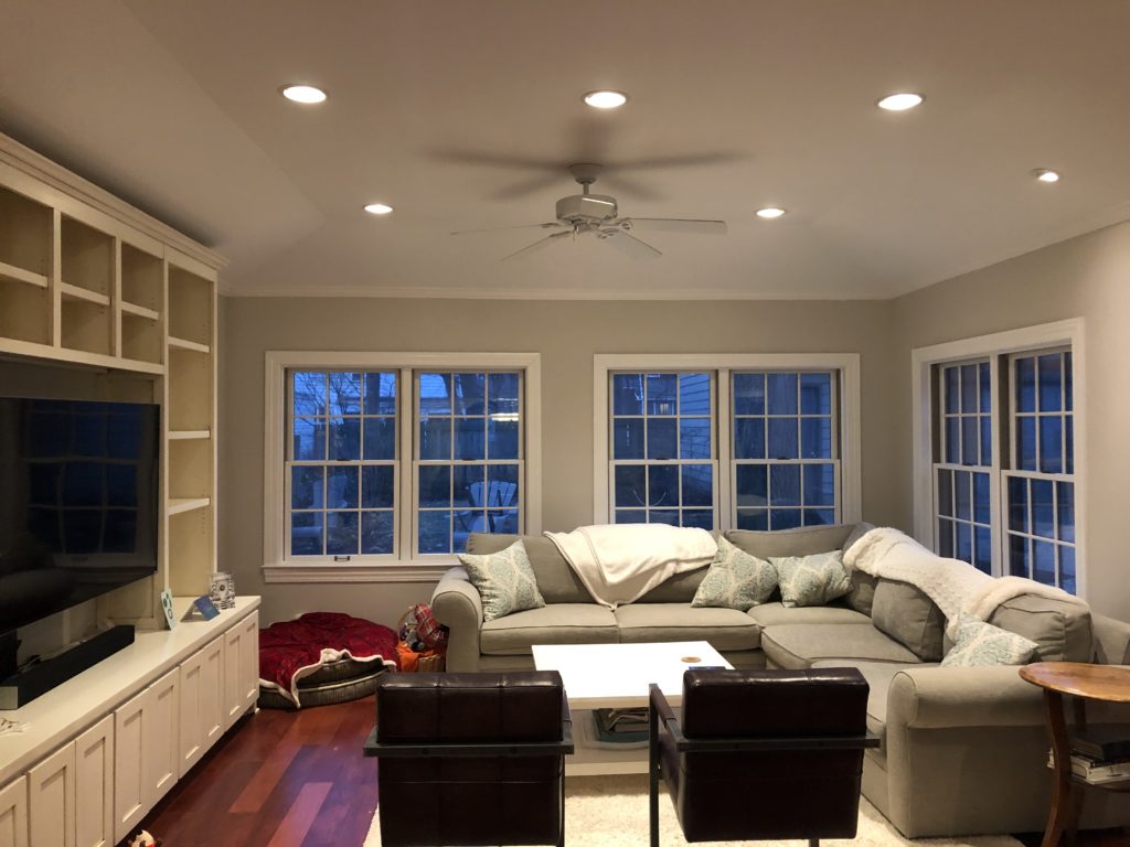
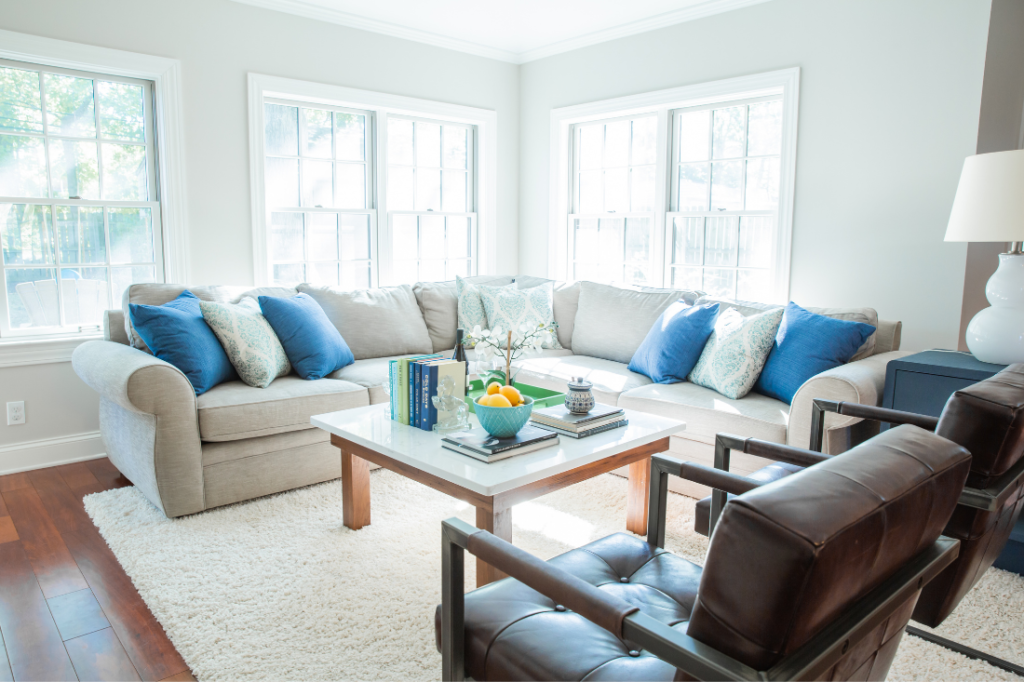
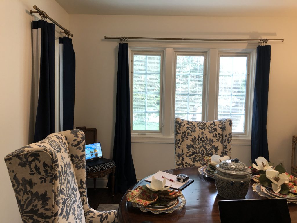
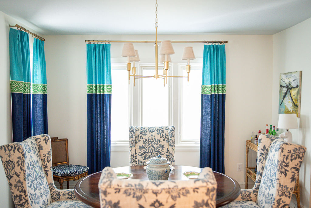
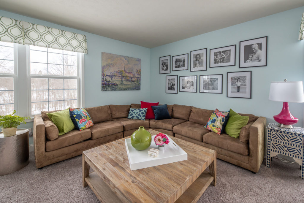
10. Playing it too safe with color
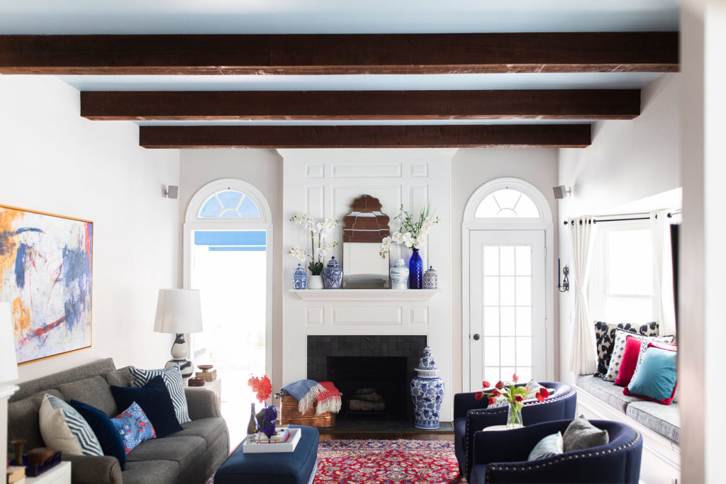
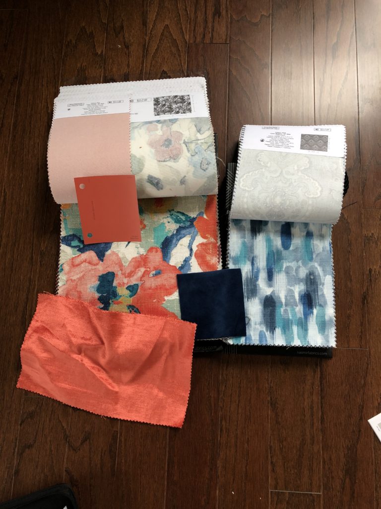
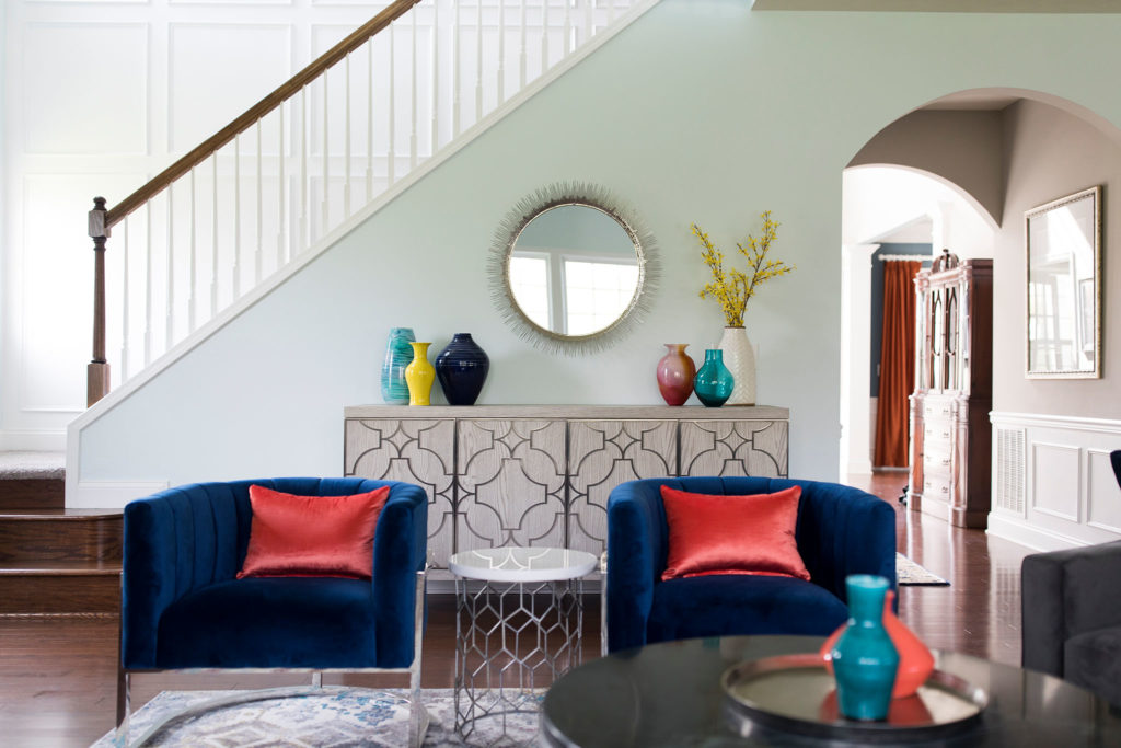
This one should in no way surprise you. My love of color is well documented. Don’t fear color! It won’t bite. If you are super color-phobic, start small. Pillows. Accessories. Artwork. Pick a color and go for it. After you get used to a little color, your confidence will increase, and you can upgrade to adding colors to your rugs, window treatments, and maybe even furniture! Check out the difference a little color made to the rooms below.
That’s a wrap! Are you guilty of any of these design mistakes? Don’t beat yourself up – they’re all easy to fix! If you need help, let’s chat!