Sometimes the bones are great, but the rest is not so great. Such was the case with this home.

My client has great taste in furniture and had already had his sofa and chairs reupholstered. He also owns many beautiful antique pieces – some of which were inherited from a relative in the interior design industry!

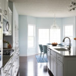
The house itself has some really neat features, such as multiple built-ins, beautiful wood floors, and huge picture windows that look out to a gorgeous nature view.

Check out that view!
So then, what was the problem? Other than the furniture itself, nothing was really my client’s taste. There were a lot of leftovers from a different house. The color palette really wasn’t my client’s favorite. He hated all the red and wanted to incorporate cooler colors into the space. He also wanted more artwork and accessories, both of which were lacking in the home.

The beautiful kitties had also done a number on the hooked rugs. All the lumps in the photo below are where the kitties had dug into the hooks and pulled up the threads.

Bad kitty! (It’s a good thing those cats are so sweet!!)
The room was also lacking light. Yes, you read that right. Despite the huge picture windows, the room had no light after the sun set. That’s kind of a problem, since for at least half the year, the sun sets at 6pm or earlier.
The dining room doesn’t have a chandelier. The only light in the whole room was coming from these two undersized, builder-grade sconces.

The living room had a couple of teensie lamps, but they weren’t powerful enough to provide enough light.

See what I mean? That’s one tiny lamp for this big room.
There was also no place for a TV, which my client really wanted to add in the space. The furniture layout in general just wasn’t optimal for the room.
So let’s recap. Here were the issues:
1. Wrong color palette
2. Worn out rugs
3. Lack of artwork and accessories
4. Bookshelves needed to be styled
5. Lack of electric lighting
6. No place for a TV
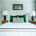
Here’s the family room “after.”

Here’s the dining room:

So, how did we resolve each design issue?
We swapped out the dark brown accent wall for a calming medium blue. We also added more color in the new pillows, artwork, rugs, and vintage accessories.

I found the vintage family room rug first and then based the color palette around the gorgeous blues, purples, and greens in the rug. (There’s even a tiny bit of ruby red in the rug, which ties into the brick fireplace.)

Another key thing to note: this rug is a cut pile rug, as opposed to a looped rug. Loops just do not work well with cats, since their claws can snag and rip up the loops.
After I found the rug, I found this beautiful impressionist painting that echoed the rug colors. It’s also BIG, which is exactly what this wall needed.
(Side note: I was originally thinking of putting two pieces of art on this wall, but then I did the furniture layout and realized we needed both of these side tables on this wall. To make the layout less choppy, I elected to do one large piece of art, instead of two. Designs often evolve due to the functional requirement of a space.)

If you take another look at the above photo, you’ll also see how we resolved another issue in the space: lack of lighting. We brought in two thin buffet lamps. (These side tables are really small, so we had to make sure the diameter of the lamp shades actually fit on the tables. Scale is ALWAYS a huge part of our designs.)
We also added a table lamp on the other side of the room in the middle of the rearranged chairs.

And speaking of rearranging, you can see we opted to put the TV on a low media stand in the corner of the room. Is this an absolutely perfect place for a TV? No. It does block some of the window. However, many times there is no “perfect” solution. You just have to do the best you can with the room.

Here’s a view of the TV from the dining room. The low, white media stand blends into the room, which was the point. We didn’t want to draw any more attention to that TV than we absolutely had to. Mission accomplished.
To make room for the TV, we moved all of the chairs around. To remind you, here was the room before.
Here, you can see the armchairs are now floating in the room, providing separation between the living and dining spaces.

Please do float your furniture. There’s no reason to have everything pushed back against the walls.
Let’s move onto all those bookshelves. My client has many talents, but arranging bookshelves is not one. It’s ok – that’s very, very common and I promise I am not going to judge your shelves. We all have our gifts. Want to know one that I don’t have? I can’t draw. like…AT ALL. See? Now we’re even.
Anyhow, here are the family room shelves before:

They mostly featured large, unused electronic equipment, some haphazard family photos, and a couple of random other things. To bring in some style and color, I opted to scour local vintage stores for books and glassware in my client’s color palette.

I was so thrilled when I found some PURPLE hobnail glassware! This stuff is pretty rare!

(Don’t worry – the family photos are now all hanging on a gallery wall elsewhere in the home. I’m not anti-family photo.)
Here are the dining room bookshelves before:

(Sorry for the bad photo. I’m a crap photographer as it is, and the light coming in from outside did not help my cause.)
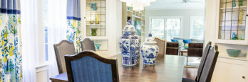
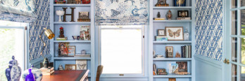
Here’s the dining room after:

My client already had all of the crystal accessories show on the shelves. He also had those two triple sets of candles. I added the vintage hobnail and milk glass pieces and arranged everything.
I also had the backs of the bookshelves painted the same blue as the walls. Now the shelves look finished and the crystal and white pieces really pop.
You’ll also note the colorful piece of art on the dining room wall. I selected this piece because it has some warmer tones interspersed with the blues and greens. These warmer tones coordinate so well with the existing warm wood furniture.

To circle back to lighting, remember those builder-grade sconces that used to be on the wall?

They didn’t give enough light. And let’s be honest. They’re vanity lights, not sconces meant for a dining room. So we replaced them.

The new sconces are much larger, which fits better with the scale of the room. They also have five exposed bulbs, as opposed to two covered bulbs, so they provide a LOT more light.
These sconces also were the inspiration for the dining room rug. Do you see the vine-like designs throughout the rug? They mimic the vines in the sconces.
That’s for these two rooms! I also redesigned a third room, but that’s going to be a separate blog post. If you need help with your half-finished room,
Here’s a cute kitty photo for your enjoyment!